ShareStone
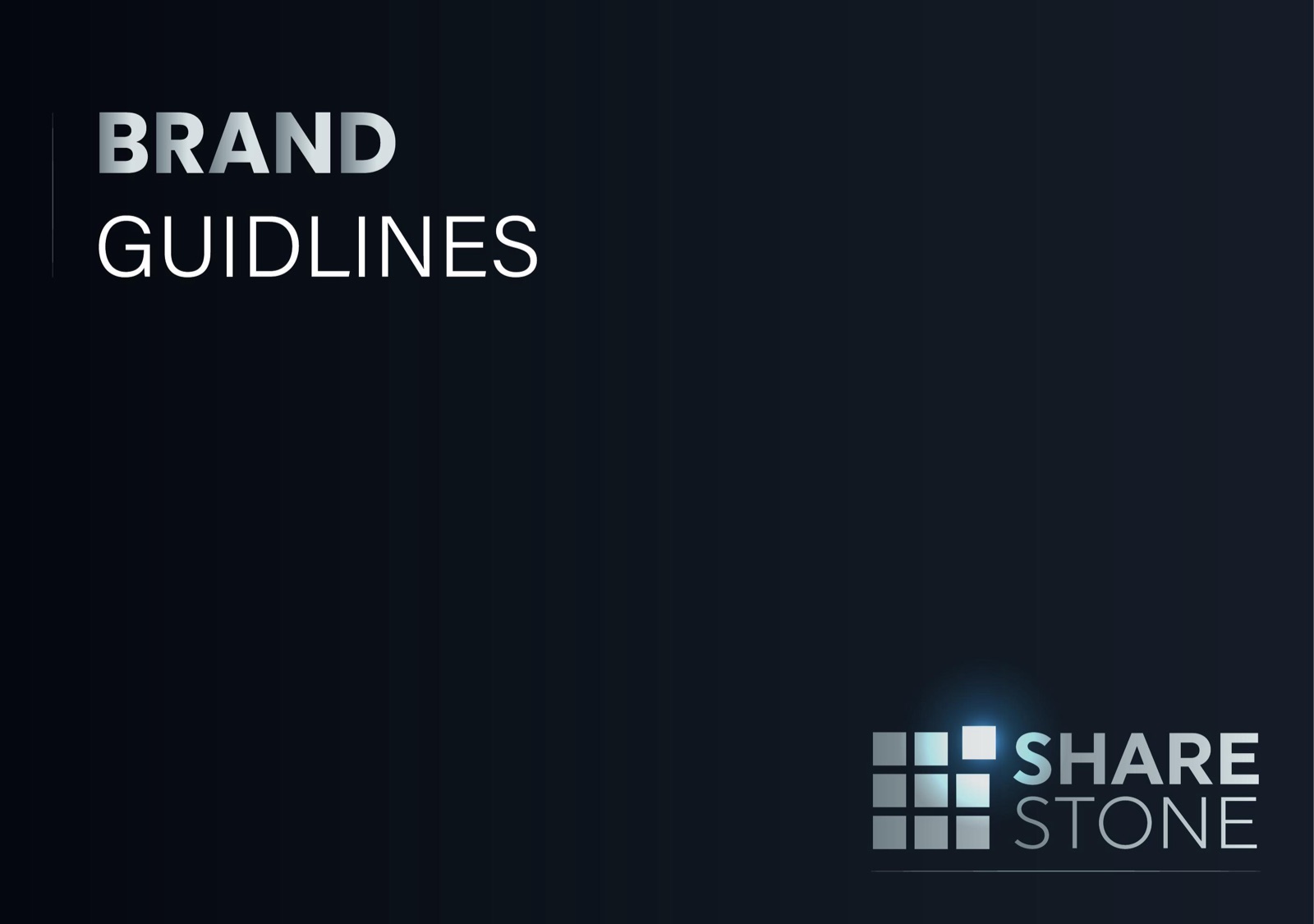
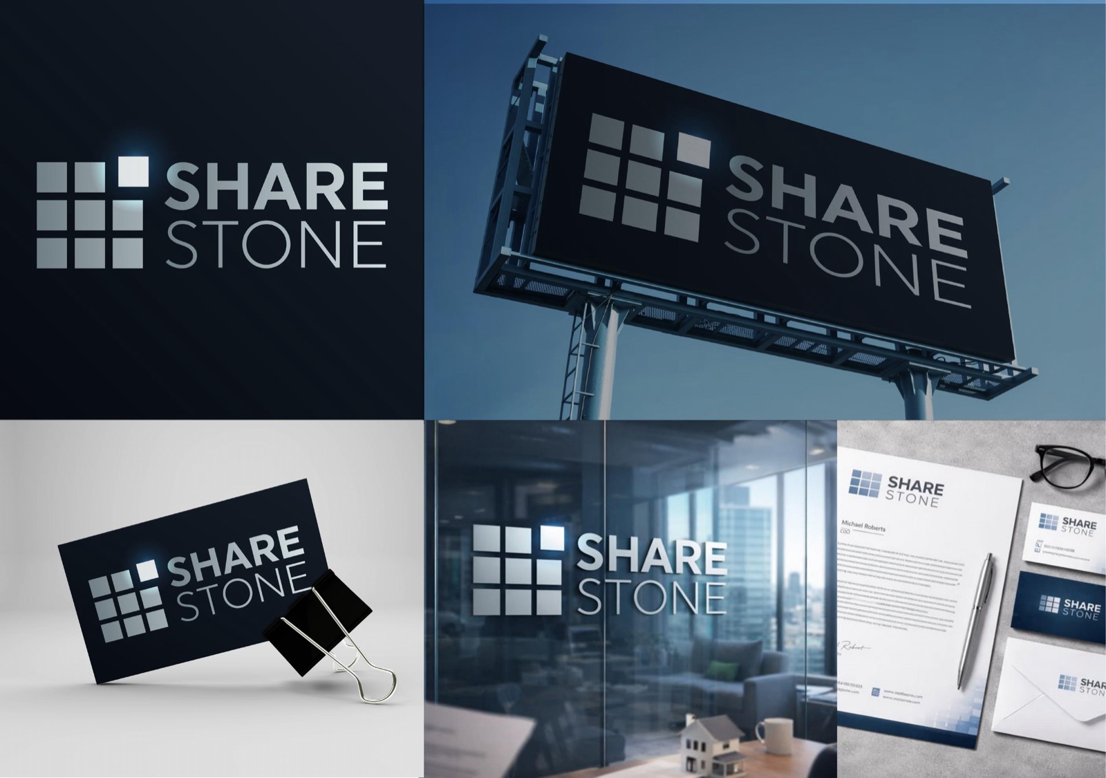
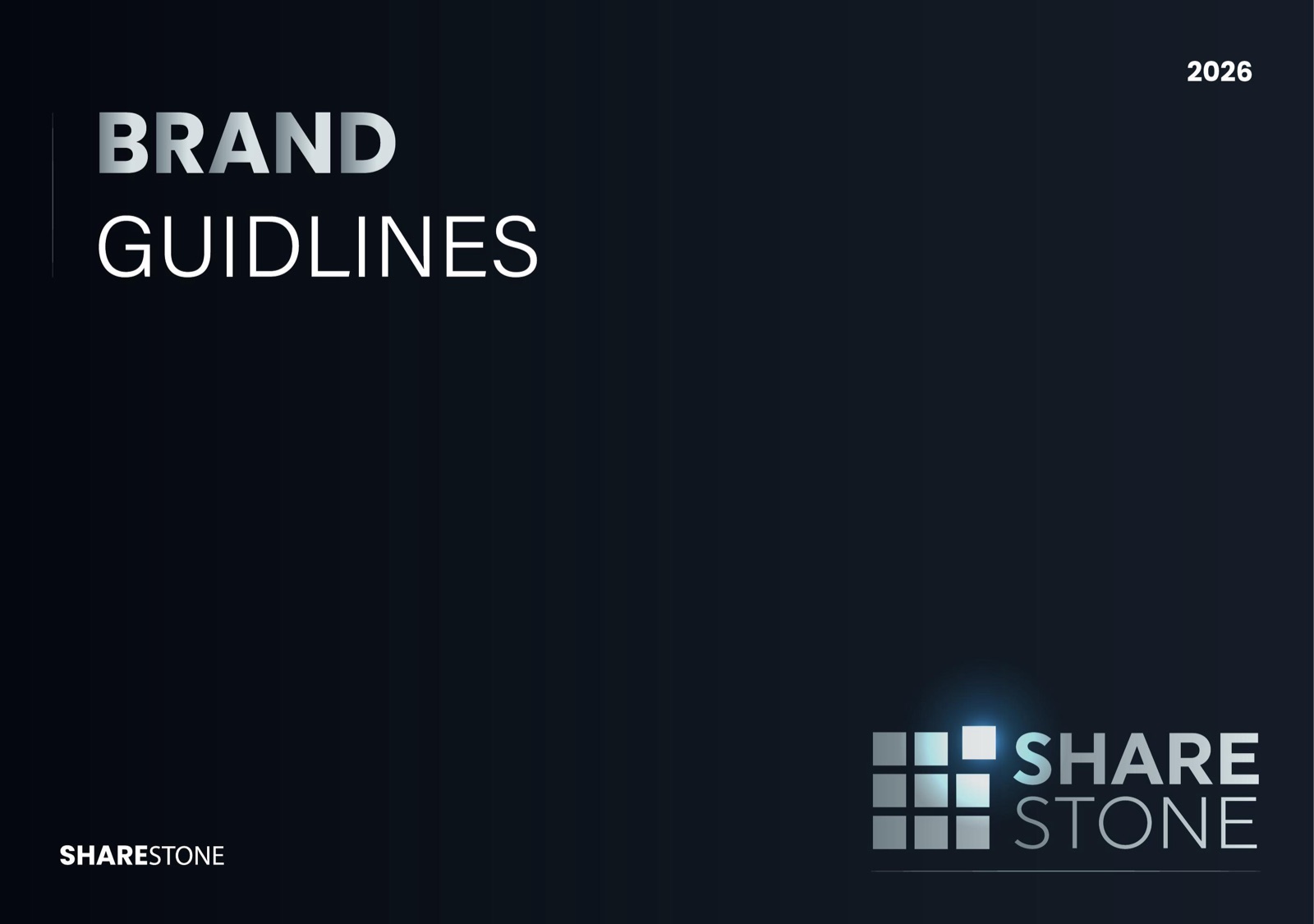
Complete brand identity and logo design for ShareStone, a fintech platform for blockchain-based real estate tokenization. A disciplined, institutional identity — dark navy, metallic silver, and a 3×3 grid mark with one glowing offset square — captured in a full brand guidelines book covering brand story, logo system, typography and colours.

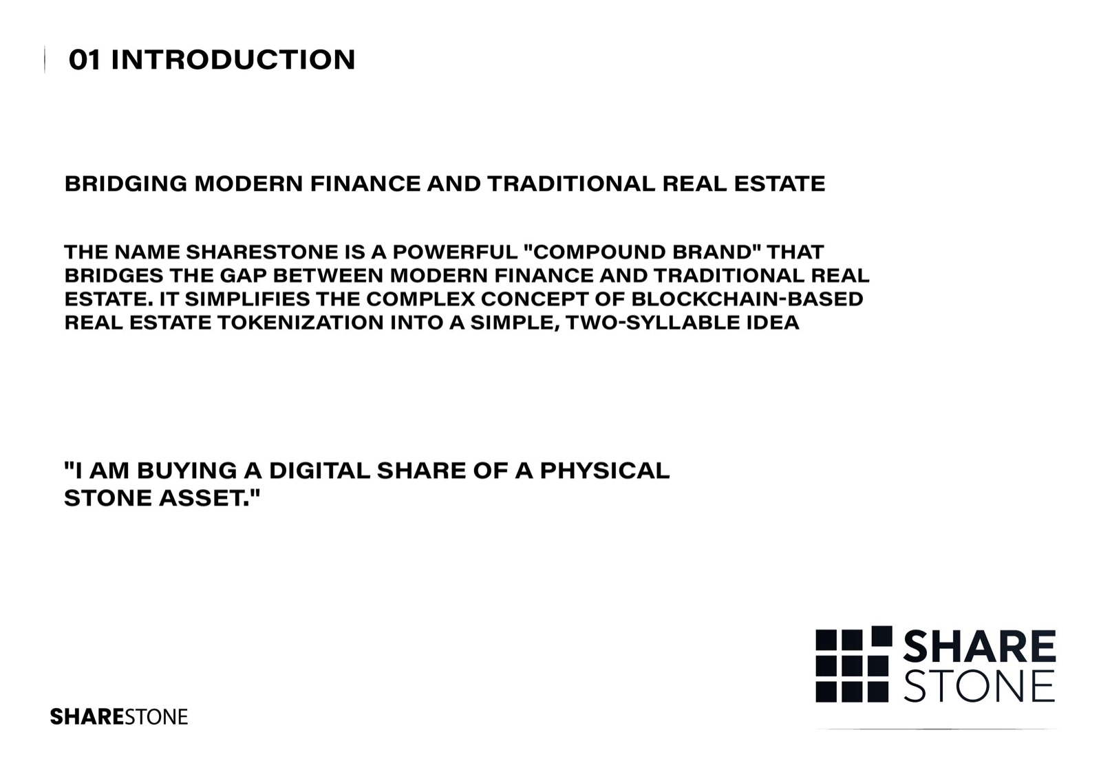
ShareStone bridges modern finance and traditional real estate: a platform that turns property into blockchain-based digital shares. The name itself is a compound brand — "I am buying a digital share of a physical stone asset" — and the identity had to make that complex idea feel simple, trustworthy and institutional.
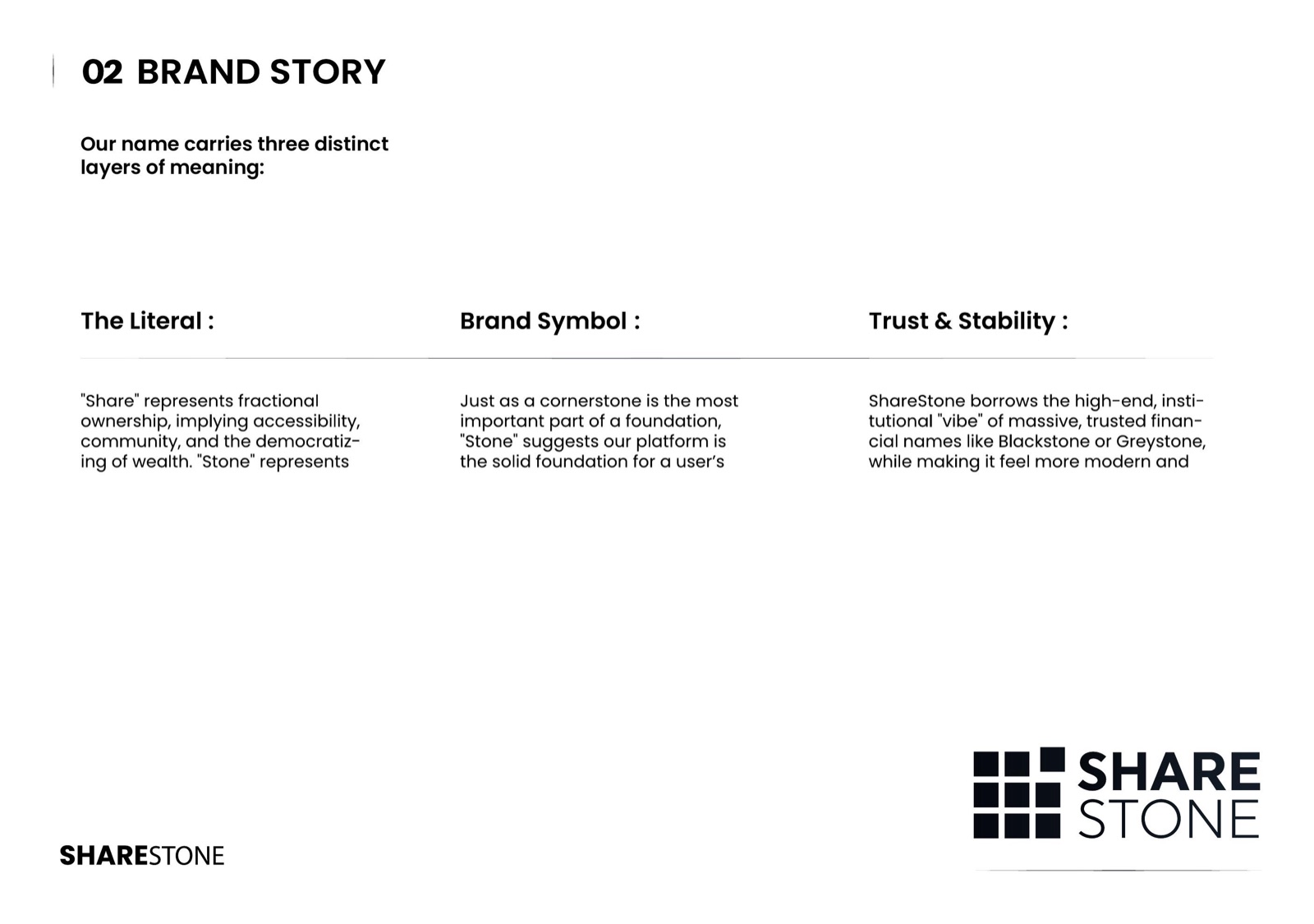
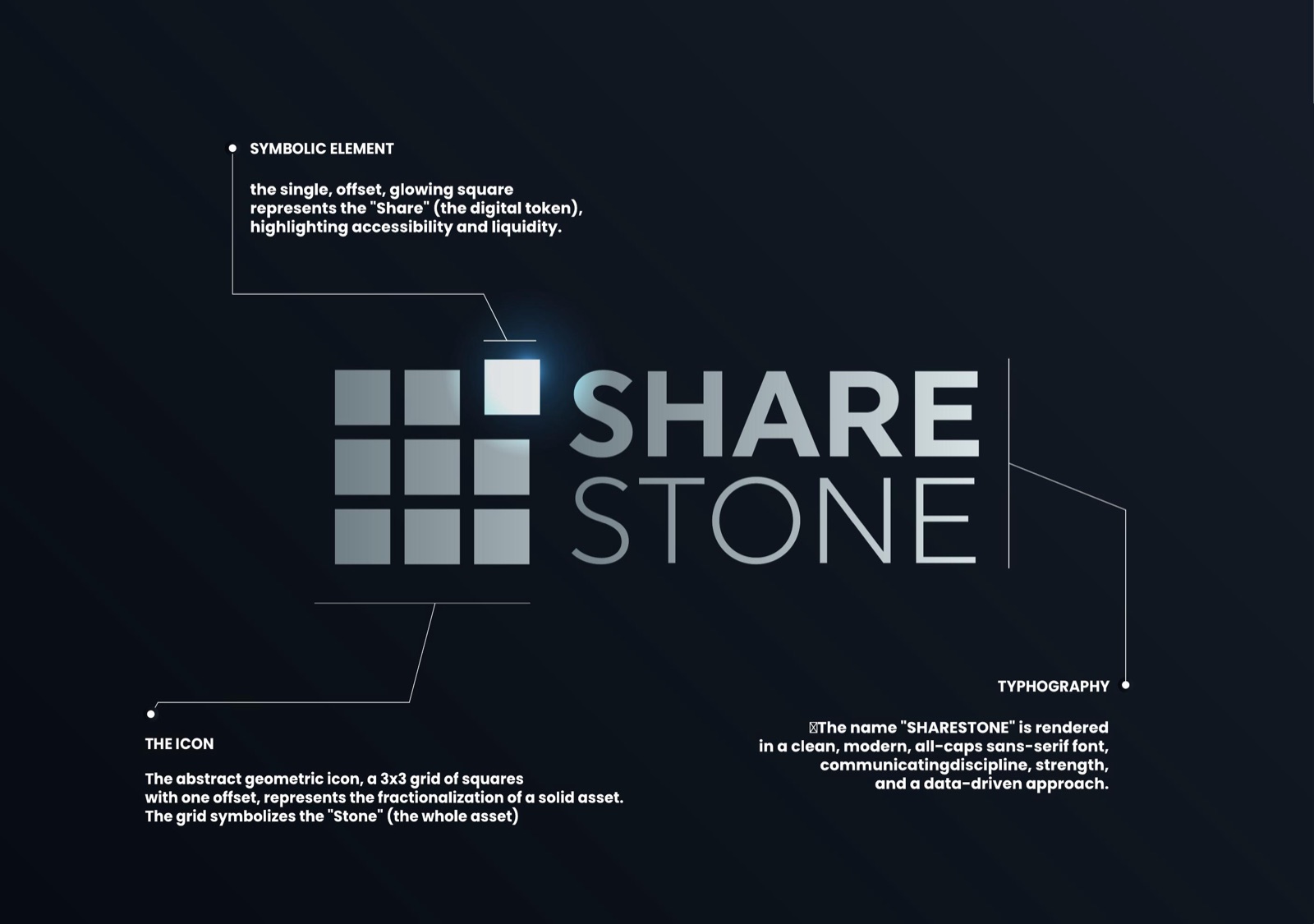
The logo is an abstract 3×3 grid of squares representing the "Stone" — the whole asset — with one offset, glowing square representing the "Share": the digital token that makes ownership accessible and liquid. The wordmark is set in a bold geometric sans-serif, communicating discipline, strength and a data-driven approach.
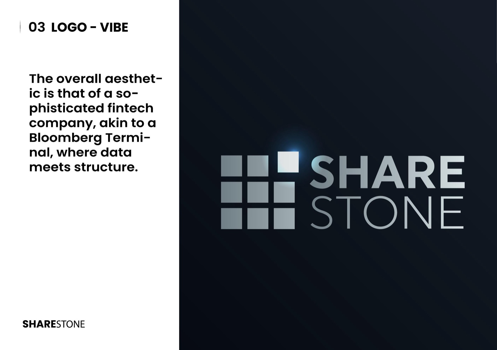
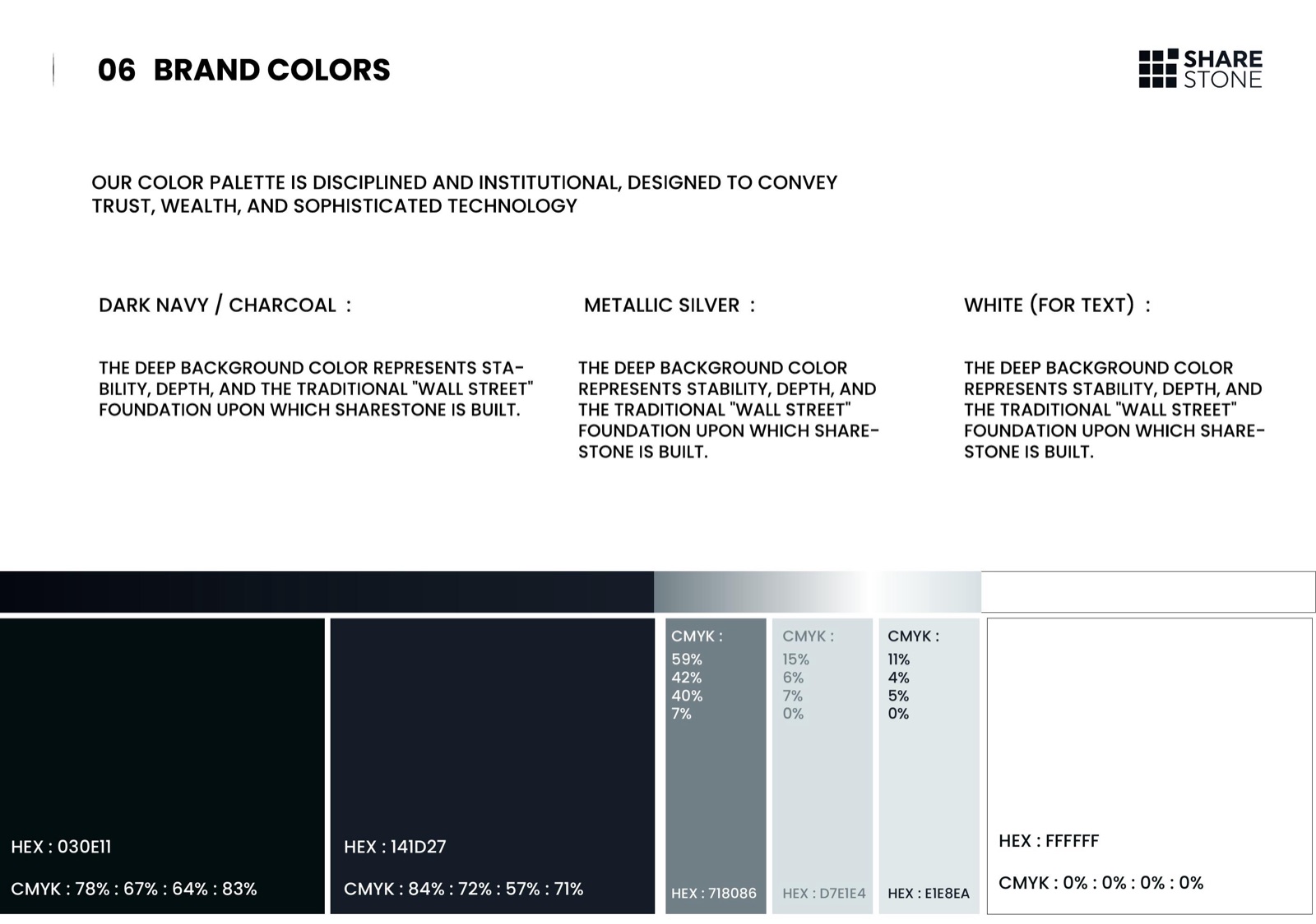
The palette borrows the gravity of institutional finance: deep navy and charcoal (#030E11, #141D27) as the foundation, metallic silver gradients for the mark, and white for text — a Bloomberg-Terminal aesthetic where data meets structure. Typography pairs the geometric display face with clean Helvetica Neue for body copy.
We delivered a complete brand guidelines book — brand story, logo anatomy and usage, typography system and colour specifications — plus real-world applications: billboards, stationery, business cards and office signage, so the brand lands consistently from a pitch deck to a building façade.